MM
5.0Reviewed May 14, 2026
This course provided a strong understanding of data analysis and visualization using pivot tables.

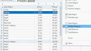
By the end of this course, learners will be able to create Pivot Tables, analyze datasets, build interactive dashboards, and interpret business insights using Excel. This course provides a complete, practical guide to working with Excel Pivot Tables and dashboards, starting from the fundamentals and progressing to real-world business and sales case studies. Learners will first master data preparation, Pivot Table creation, and Pivot Charts, ensuring a strong analytical foundation. They will then apply these skills to stock analysis, learning how to evaluate performance, compare trends, and calculate meaningful metrics. What makes this course unique is its hands-on, project-driven approach. Learners will design interactive project dashboards, use slicers and filters, and apply best practices for formatting and usability. The course concludes with company and sales case studies, helping learners translate raw data into actionable insights that support decision-making. With structured modules, practice quizzes, graded assessments, and real-world examples, this course is ideal for business analysts, Excel users, and professionals who want to strengthen their data analysis and dashboarding skills using Pivot Tables.
MM
This course provided a strong understanding of data analysis and visualization using pivot tables.
SD
The course helped me transform raw data into meaningful insights.
DD
A very well structured course for anyone interested in finance and capital markets.
AA
An excellent course that explains Excel Pivot Tables and dashboard creation in a very practical and easy-to-understand way.
PP
A well structured and engaging course with clear explanations.
JJ
The course helped me transform raw data into meaningful insights and interactive dashboards for better decision-making.
TT
Fantastic learning experience that combines analytics and visualization effectively.
RR
The dashboard techniques, slicers, charts, and analytical methods taught in the course significantly improved my reporting and presentation skills.
Showing: 9 of 9
The dashboard techniques, slicers, charts, and analytical methods taught in the course significantly improved my reporting and presentation skills.
An excellent course that explains Excel Pivot Tables and dashboard creation in a very practical and easy-to-understand way.
The course helped me transform raw data into meaningful insights and interactive dashboards for better decision-making.
This course provided a strong understanding of data analysis and visualization using pivot tables.
Fantastic learning experience that combines analytics and visualization effectively.
A very well structured course for anyone interested in finance and capital markets.
The course helped me transform raw data into meaningful insights.
A well structured and engaging course with clear explanations.
Great course 👍 i learned a lot